2020 Ford Escape Interior Driveway Test | Bins and screens and sliding seats, oh my
Ford’s compact crossover entry has been cleaved in two. While the last Ford Escape was a crossover SUV with sporty handling inherited from the Focus compact car it was mechanically based upon, the new one leans much harder into its car lineage and is pretty much an enlarged next-generation Focus (you know, the one they don’t sell here). It’s lower, lighter and more carlike in appearance, as well as in the way it drives. If you want your crossover to be more like an SUV, well, the new Bronco Sport leans hard in that direction.
Inside, you can tell the two share a common architecture by looking at the center stack and console: they’re identical from the climate controls to the armrest bin. Everything else is softer and more organic in appearance in the Escape, echoing the exterior and general car-like ethos.


We’ll have to save further comparisons for when we actually see and drive the Bronco Sport in person. For now, let’s take a closer look at the Escape interior, including its technology, storage and materials quality.
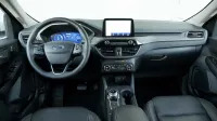
Starting with the SE trim, the Escape includes the 8-inch touchscreen running the Sync 3 interface. The base trim level basically has a smaller non-touch display with surrounding buttons. There’s also a decidedly low-tech instrument panel. You can see both in this photo.

In-car technology
In general, I like Sync 3’s clean, easily read graphics featuring large icons on a white background. This addresses one of the many complaints about the system’s MyFordTouch predecessor with its black backgrounds and tiny icons (though I never thought MFT deserved the overall bad rap it got). Its processing speed and responses are also quite good, and it brings with it Apple CarPlay, Android Auto and satellite radio. There is a USB-C port in the forward smartphone bin and a regular USB port under the center armrest. Both work for charging as well as car-to-phone communication. That’s appreciated.
There are issues, however. See those easily read and -pressed menu buttons in the photo above running at the bottom of the screen? They’re great, except they disappear once you go away from the Home screen, meaning you have to go back to the Home screen in order to go between the Audio and Navigation menus, for instance. There are also no physical menu buttons as you get in many tech interfaces. This constant back-and-forth is frustrating.
So too is the Apple CarPlay functionality. Ford is one of many companies that opts to lock out many CarPlay functions when the car is on the move. For instance, you can’t see or select from your entire Playlist connection by using the touchscreen. Instead, it just shows recently played Playlists, and then when you try to select one, doesn’t actually play it. Grrrr! The work around is using Siri. No thank you.
The other issue involves navigation. Ford is the only company I’ve encountered that locks out its own native navigation system when Apple CarPlay is in use. Pressing the Map button brings you to Google Maps or Apple Maps, instead. “Who cares?” you might ask, “I always use Google Maps.” Fair enough, except for three things. First, you’ve paid extra for the native navigation system and now the car isn’t letting you use it. Second, should you be in an area without cell data, you can’t search for or enter a new destination in an app-based navigation system. You can in the car’s native navigation system. Third, the native navigation system is better at identifying where you are on Earth than a smartphone-based app. Earlier this year while in downtown Vancouver, Google Maps showed me driving through buildings and in the wrong direction. The Toyota system knew exactly where I was.
The solution to both problems was to simply disable CarPlay and do things the old-fashioned way. As it turns out, Ford’s native controls for selecting music, podcasts and phone contacts on your smartphone are perfectly functional.


The 12.3-inch instrument panel is standard on the Hybrid and the gas-only Titanium. It looks sharp, and although the information shared is broadly the same, the design changes based on drive mode. Clockwise from upper left: normal, eco, sport and the whooshy graphic that comes up when you switch to sport mode. I’ll take the sport look, thank you.

The Titanium has a head-up display, but rather than projecting information onto the windshield, it does so onto a clear piece of plastic that rises out of the IP shroud. Mazda and Hyundai have used something similar to this. It’s further from your line of sight than a typical HUD and closer to the gauges, so I didn’t use it. Thankfully, shutting it off is as easy as pressing a button on the steering wheel.

Interior storage
The last-generation Escape’s interior storage was pretty pathetic in the beginning. The armrest bin was extremely deep but limited in length and width. It was almost like a box a fancy bottle of booze comes in. There was also no other storage for small items beyond the cupholders — my parents own a ’13 Escape and always fill the cupholders with sunglasses and their garage-opening key fob. A mid-cycle refresh added some storage by going to an electronic e-brake, but the 2020 redesign makes significant strides.


That’s an iPhone 6, which is a smaller smartphone, but you can still see how much volume is in this bin. It’s also a grippy, rubberized surface with large bumpers on either side, so no repeat of the Honda CR-V flinging my phone across the foot well.
Now, according to Ford’s configurator, a Wireless Charging Pad should be standard on the Titanium, but this car’s window sticker didn’t indicate that, and there wasn’t the usual wireless emblem or off/on button. My phone isn’t wireless charging capable, so I don’t know for sure, but it sure doesn’t seem like this car had it.


These cupholders are large, useful and keep items in place, including the tall Yeti bottle and the ceramic travel coffee mug. There’s also a little holder in between them that I suppose would be good for a Red Bull-style can.
You’ll also note here that the Escape has a rotary shift knob. Of all the electronic shifters with alternative means of gear selection besides a stick-like thing that goes through PRND, this is the one that makes the most sense. It follows the same PRND order, but with you turning left and right instead of sliding up and down. It makes equal sense. Also, if you turn the car off when still in drive or reverse, it’ll motor back to Park. Good idea. And unlike some Land Rovers and Jaguars that put their space-saving rotary electronic shifters to horrible use by placing them in the middle of the console surrounded by plastic, this one takes up little room and is a big reason why the rest of the console is so voluminous and useful for small-item storage.
Behind the shifter is where the buttons for the e-brake, auto hold, drive modes, automatic parking, parking sensors shutoff and automatic stop/start shutoff are.


My wife’s small purse fits under the armrest. Barely. It fit more easily in the Honda CR-V and not at all in the Toyota RAV4.
The glovebox looks like that. Typical.


The front door has an interesting pair of bottleholders. You can’t really use them at the same time. The one on the right allows you to hold most bottles (say the typical tall Acura ELS metal bottle in the upper right pic). However, should the bottle be bigger (say, the Yeti), then the holder on the left is wider and on an angle to allow it to fit. This is clever. Great feature. Much better than the CR-V’s doors.


The back door, by contrast, couldn’t hold either of my metal bottles. They do fit in the fold-down center armrest, though. The Yeti couldn’t in the CR-V, but could in the RAV4.

Materials
The Titanium has wood-look trim. It isn’t convincing. My father is visiting and thought it looked cheap. I concur. This can be presented as Exhibit A for why the RAV4 has the right idea about using color to differentiate models rather than fake wood, metal or carbon trim. Come to think of it, the last Escape dispensed with any sort of adornment like this and was better for it.


In general, it seems like the new Escape’s materials quality is worse than its predecessor’s. The black door trim is soft-ish to touch, but it feels cheap. The old one had cloth or pleather on the middle of the doors along with a higher-quality material on the sills.
Above right, you can see the hard, scratch-prone plastics in the cargo area. This stuff will quickly look terrible once you start putting suitcases and other items against it. Again, the old one had better stuff in the back. It was also bigger and boxier, but we’ll cover the cargo area in a separate luggage test.


Fit and finish
This is only one car, and you cannot judge an entire model or brand by one car’s defects. As such, I cannot declare this poorly fitting door panel as being broadly indicative of the 2020 Escape, but at the same time, it’s also extremely rare for test vehicles to have such defects.


Sliding back seats
One advantage the new Escape has over its predecessors, and indeed many of its competitors, is a sliding back seat that provides a wealth of legroom as well as improved comfort and cargo versatility (less so cargo space, but again, more on that in a luggage test).
Top left: The seat slid all the way back and upright.
Top right: The difference between upright and reclined.
Bottom left: 40 portion is fully forward and fully upright. 60 portion is all the way back and fully reclined.
Bottom right: How much space is added when sliding the seat fully forward.
And finally …

The Escape’s air vents are quite low. Presumably, this is to allow the touchscreen to be higher and therefore within easier sight and reach. This placement also lets the dash be lower, which makes the cabin feel airier. Those are all good things.
Unfortunately, the damn air vents blow directly onto your right hand at 3 o’clock. That’s annoying. Also cold. The Bronco Sport has its vents flanking the touchscreen, which is better for your hands, but does create more of a monolithic look. You win some, you lose some.
Related Video:

